Life IS better at the beach especially in the fall and winter when the beach is empty. It's always been one of my favorite places to go when I'm stressed and need a break from things.
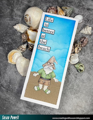
Coloring the Beach Gnome image from KLM Digital Designs reminded me of when I'd go to the ocean and the beach was deserted. I need to do that again.
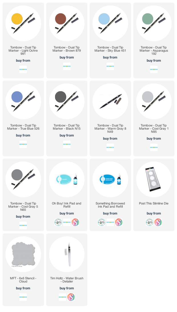
I printed the image onto some Mixed Media Paper. I use Canson - I found a HUGE book of it at Michaels a long time ago and it's still going strong. I colored him in using my Tombow Dual Brush Pens - seriously LOVE those pens! I've linked to the colors below except for one that is a darker green that the writing on the side has rubbed off. Sorry about that. I'll try to figure it out and add it below when and if I do.
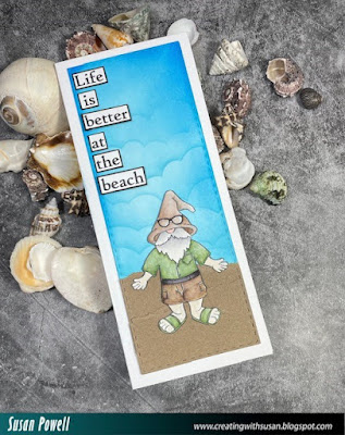
After coloring the image I did struggle for a while as to how to build the scene. I had one way in mind then messed it up by dropping an ink pad on the card but thankfully it didn't hit the image so I fussy cut him out and started again. I decided to do a slimline card this time and make the sentiment a bigger part of the card.
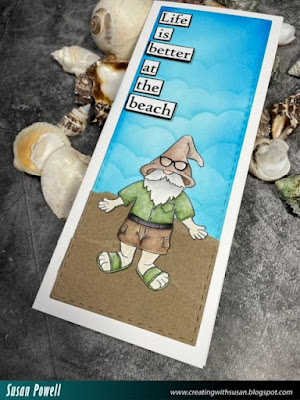
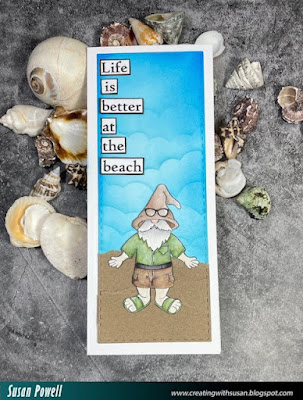
I cut a panel using a stitched rectangle die then added some Kraft paper for the beach. I tore the edges of that to give it some texture. I used the MFT Cloud stencil and some Catherine Pooler inks to add the sky - they don't really look like clouds as I was a little heavy handed with the ink making it look a little stormy which I decided I was okay with because I love storms and I didn't want to start again. I cut apart the sentiment and layered each word onto some black card stock then adhered it to the panel popping up the words 'better' and 'beach' with some craft foam.
I added the panel directly to a slim line card base. I may end up using the panel as part of a scrapbook page I have in mind but for now it's a card.
Thanks so much for spending part of your day with me.
Take care,
Susan
Shopping list:
I use affiliate links when I can. This allows me to earn a small commission at no additional cost to you. Thank you for your support!!!
Comments